Physical Address
304 North Cardinal St.
Dorchester Center, MA 02124
Physical Address
304 North Cardinal St.
Dorchester Center, MA 02124

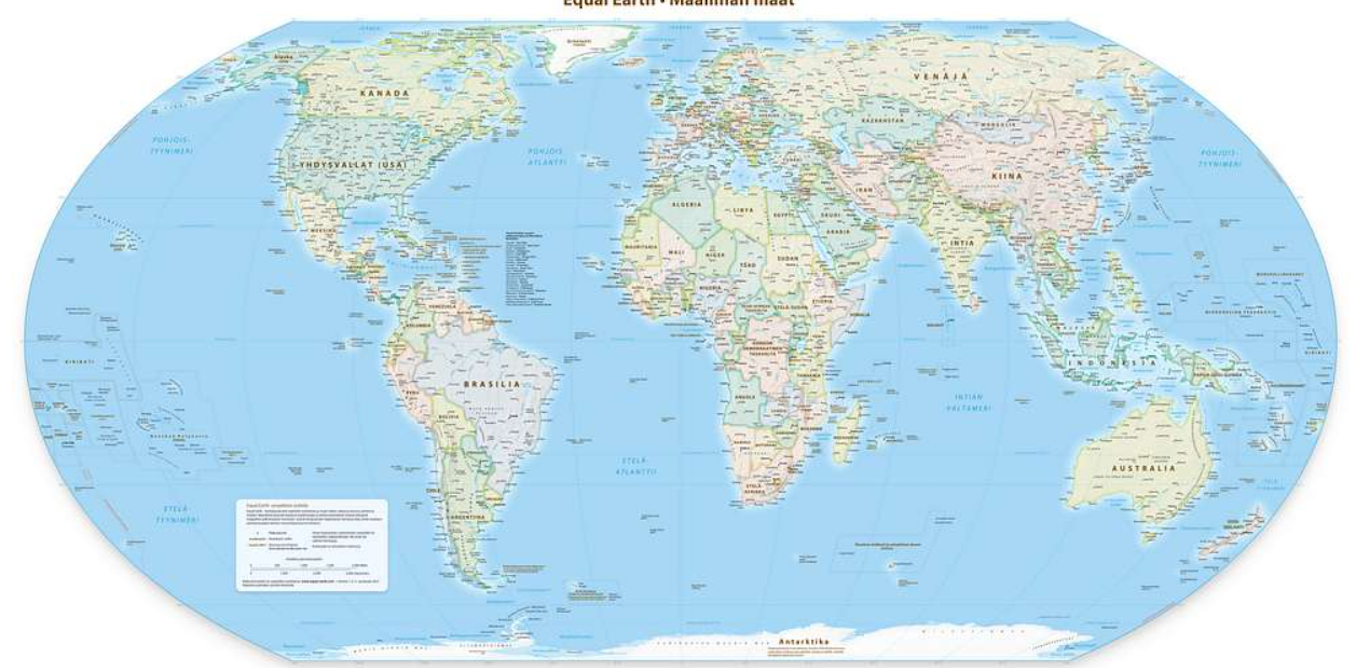
Maps lie. Not always on purpose, but they do. Every world map you have ever seen in a classroom, a textbook, or on a government wall has shrunk Africa — and for centuries, almost nobody questioned it.
That is starting to change. The United Nations recently passed a resolution endorsing the Equal Earth Projection, a map that more accurately represents the true size of the world’s landmasses. It is a technical shift, yes, but it carries enormous political and cultural weight — especially for a continent that has long been made to look smaller, and therefore less significant, than it really is.
Here is the core problem. Earth is round. Maps are flat. Converting a three-dimensional sphere into a two-dimensional surface always creates distortion — there is no way around it. Cartographers Jack Swab and Derek Alderman, who study the social and communicative power of maps, are clear on this point: no projection is perfect, but some are far more misleading than others.
The Mercator Projection, the map most of us grew up staring at, was designed in 1569 by a Flemish geographer primarily for naval navigation. It keeps compass bearings accurate, which made it invaluable for European sailors crossing oceans. But it comes with a brutal side effect — it massively inflates landmasses near the poles while compressing those near the equator. Countries close to the north and south poles can appear anywhere from two to fourteen times their actual size. Africa, sitting squarely on the equator, gets crushed.
The Equal Earth Projection, developed by cartographers in 2018, corrects this. It minimises size distortions across the globe, allowing viewers to compare regions — their populations, environments, economies, political weight — on genuinely fair terms. Africa, in this projection, looks dramatically larger. Because it is.
Not entirely. The Mercator Projection still does its original job well. Google Maps, Apple Maps, and most digital navigation tools rely on a version of it precisely because it preserves the accuracy of compass bearings between two points — a feature that the Equal Earth Projection cannot replicate for navigation purposes. So when you are trying to get from point A to point B, Mercator remains the practical tool. The issue is not navigation. The issue is education, policy, and global perception — and that is where Equal Earth steps in.
Be clear about one thing: the UN resolution is non-binding. It endorses the Equal Earth Projection as a fairer representation of the world, but it does not force any government, school system, or media outlet to switch maps overnight. Map-making is decentralised. No single global authority controls which projection gets printed in textbooks or displayed in government offices.
Real change requires deliberate, funded action — revising educational materials, updating databases, reforming how maps appear in diplomatic and media contexts. That takes money, political will, and time. The Equal Earth map is already available as a wall print and has appeared in a growing range of media since its 2018 launch, but individual institutions and governments still need to actively choose it over the Mercator default.
Resistance has been relatively limited, though telling. Several nations abstained from the UN vote, many over disputes about how contested territories — particularly Crimea — are depicted on the Equal Earth map. Ukraine objected to its portrayal as contested territory; Russia responded with its own objections. Cartographers and observers largely viewed these interventions as geopolitical posturing rather than genuine concerns about map design.
The only outright “no” vote came from the United States. American delegates called the proposal a “radical and ideological project” and rejected the idea that the UN should link Mercator’s distortions to colonial legacies and the historical marginalisation of Africa. This position sits awkwardly alongside President Trump’s own ideologically driven map interventions — unilaterally renaming the Gulf of Mexico to the “Gulf of America” and Lake Ontario to “Lake America,” moves made without international consultation and for transparently nationalist reasons. The contradiction is hard to ignore.
African nations framed their push for the Equal Earth Projection around the concept of “cognitive justice” — the idea that people instinctively associate a place’s size on a map with its importance in the world. When Africa appears smaller than Greenland, or roughly the same size as the contiguous United States, it sends a subliminal signal about power and relevance that shapes how global leaders think and act.
The reality is staggering in comparison. Africa is the world’s second-largest continent, home to some of the planet’s fastest-growing economies and fastest-growing populations. Its youth demographic — the largest in the world — is precisely the generation that will define the continent’s trajectory over the next fifty years. A map that shrinks Africa does not just distort geography. It distorts ambition, expectation, and political imagination.
No map projection alone rewires centuries of bias. But as African nations push for greater influence in international institutions, trade negotiations, and climate discussions, correcting the mental image that global decision-makers carry matters more than it might seem. The Equal Earth Projection is a small, concrete, visual step toward a world that sees Africa — finally — at its actual scale.